Dec
17
2013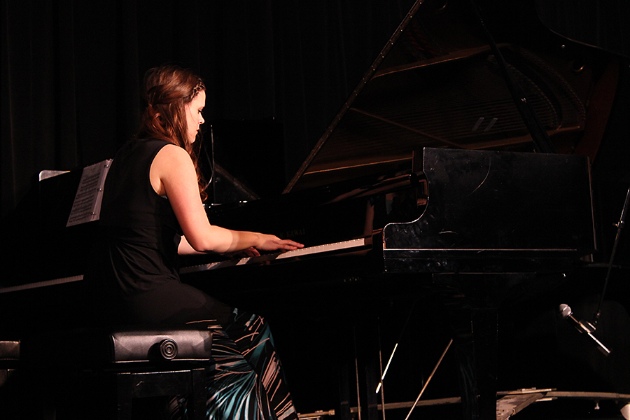
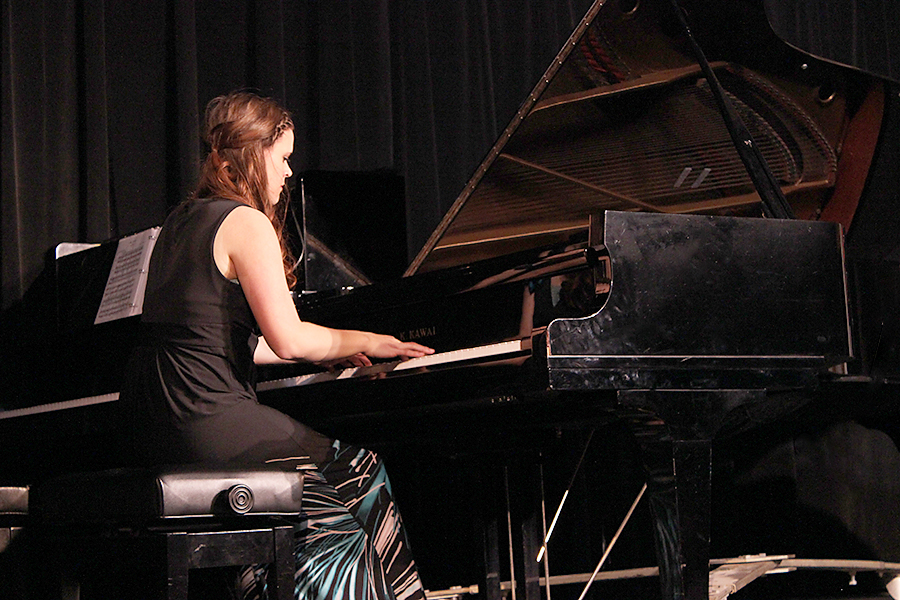
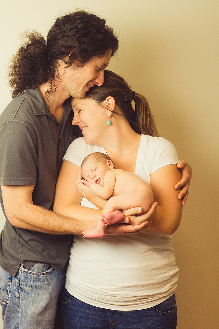
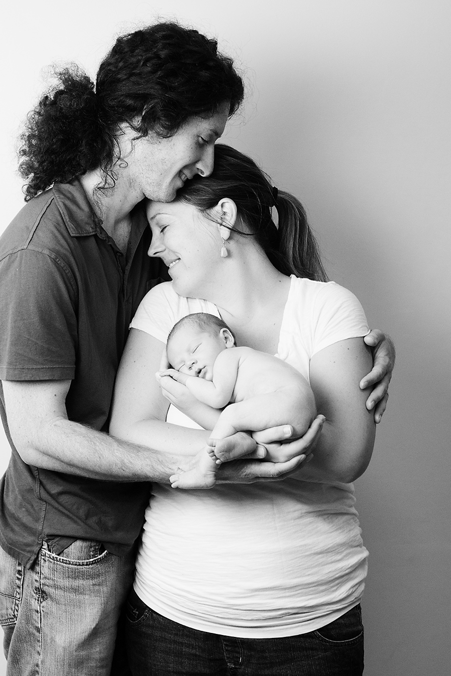
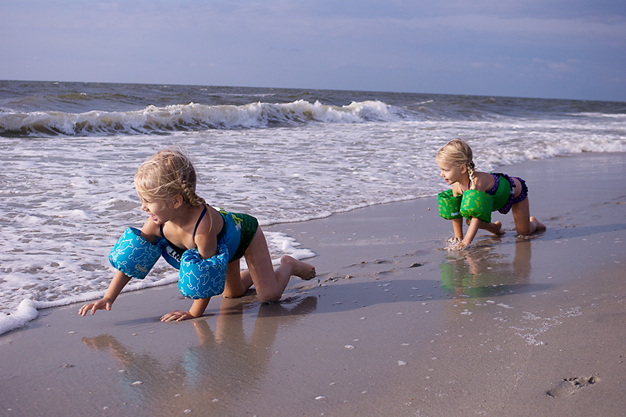
Amber took this image of her sister for our Rule of Thirds assignment. She did an excellent job capturing the scene, but exposing for her sister (as she should have) produced a very dark image because of the setting. I asked Amber if I could borrow her image and tweak it just a bit.
So here is a quick tutorial for how I would edit this image in PSE 9.
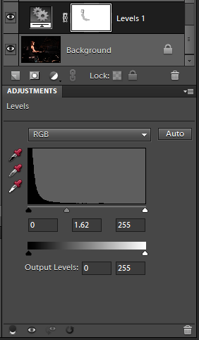
- Opened a Levels layer. I grabbed the midtones slider and pulled it over toward the left. This makes the midtones begin earlier, brightening the whole image. Then, I used a soft black brush at 27% opacity to remove some of the brightness on her skin while I had the levels layer mask selected.
- Opened a Brightness/Contrast layer and adjusted the brightness to taste. I also brushed some of this extra brightness off her skin.
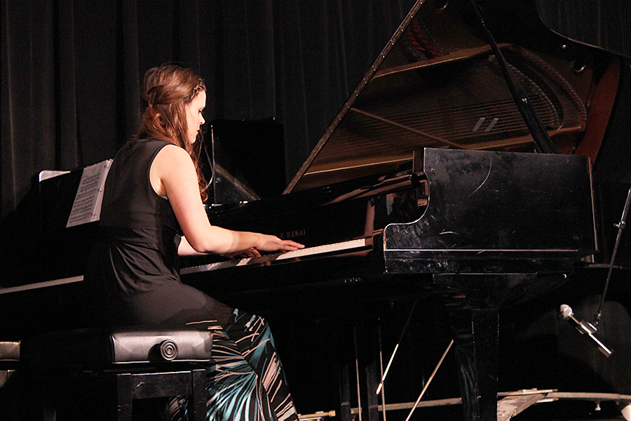
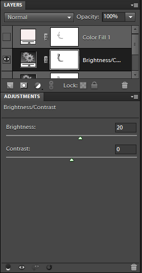
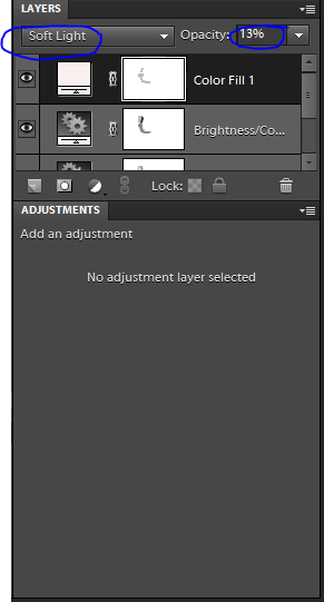
- Opened a Solid Color layer. Selected a pale rose color (#f9efef). Changed Layer Setting from Normal to Soft Light. Reduced Layer Opacity to 13% and brushed some of the color off her skin. This layer would be totally optional. And if you chose to use it you could pick any color you wanted. I just liked the extra touch of rosy/pink 🙂
- Finally I cleaned up the piano a bit and removed the microphone, just because I could with the Spot Healing Brush.
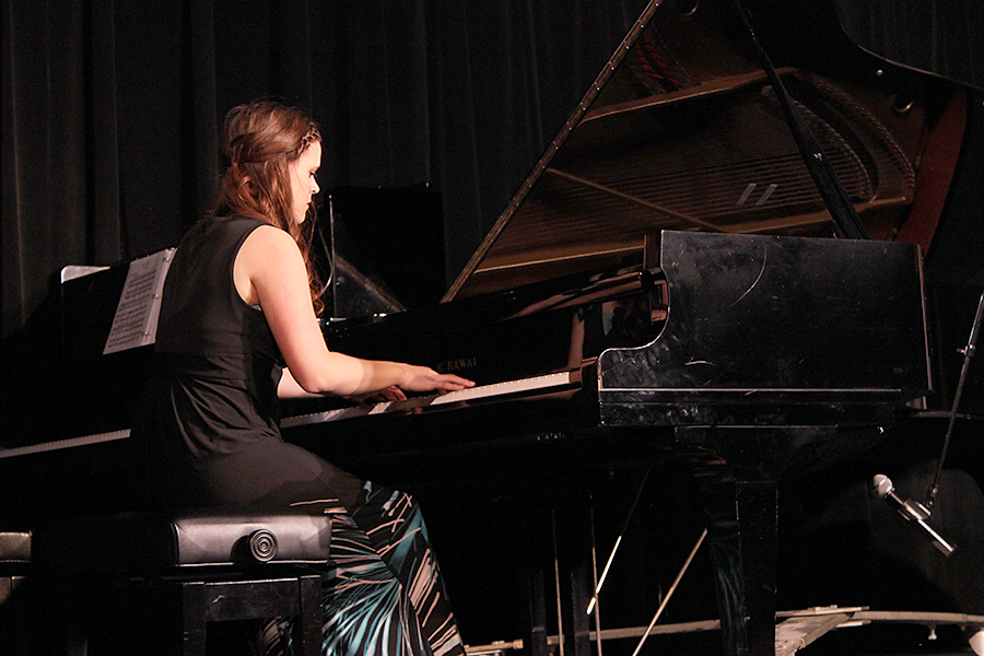
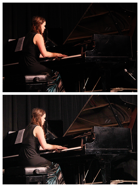
Here’s your side by side before and after.
Which do you like better? How would you want to edit this differently?
Dec
10
2013The Layer Mask is sort of the king of the good photo editing software. But it’s kind of hard to explain. Let me try in plain English. You know those Name/Word Canvases that you get little kiddos to make? Here’s an example from pagingfunmums.com.

You lay down the masking tape in the arrangement you want and then you paint over top. Later you peal off the masking tape to show your design. That’s what a layer mask does. You apply your extra work, but then decide you don’t like it in just a few places or that you only want it in a few places and so you mask off the portions you don’t want effected by the changes. Does that make sense? I hope so.
How to Apply and Use a Layer Mask
Note: I’m about to use a technique that I think is cheesy in most cases. It’s called Selective Color: where most of an image stays in black in white but you select one thing to remain colored. I’ve used this technique two times ever and in both cases I think it was cheesy. In fact, the only places I’ve seen it done tastefully was Schindler’s List and Disney’s Paperman Short Film. I’m only using this technique here because it’s really easy to see the effect of the layer mask. However, layer masks are useful in everything: from layers to curves to skin smoothing to creating beautiful vignettes. If you can dream it… a layer mask can isolate the technique. So I’ll show it in selective color first so you can see what I’m doing, and illustrate a layer mask technique with a vignette where I physically have to add the Layer Mask.
Using a Layer Mask with a Brush
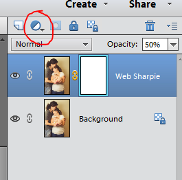
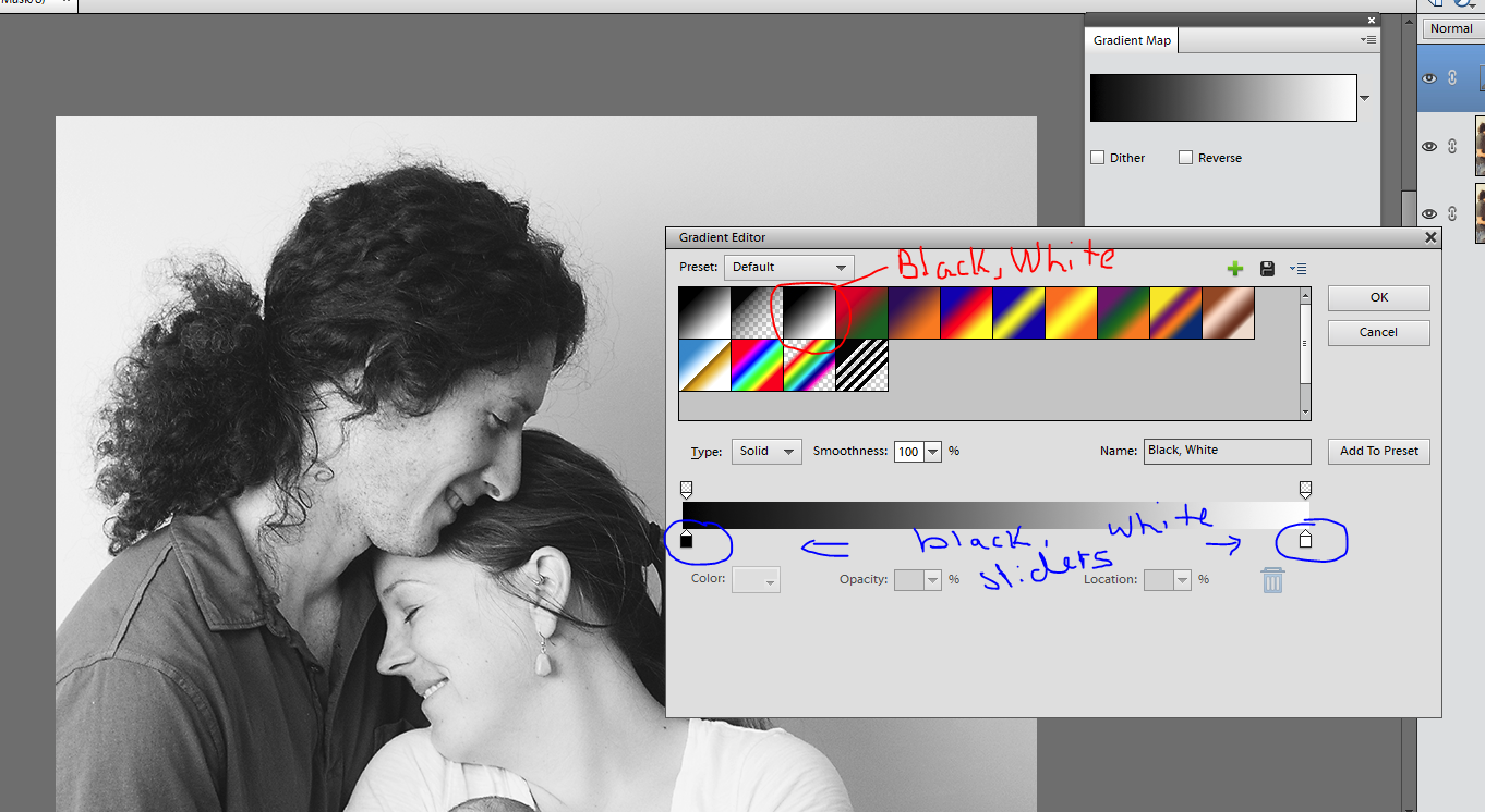
Here is an image I’ve turned black and white. Gradient map comes up with a layer mask attached. I’ve circled that below.
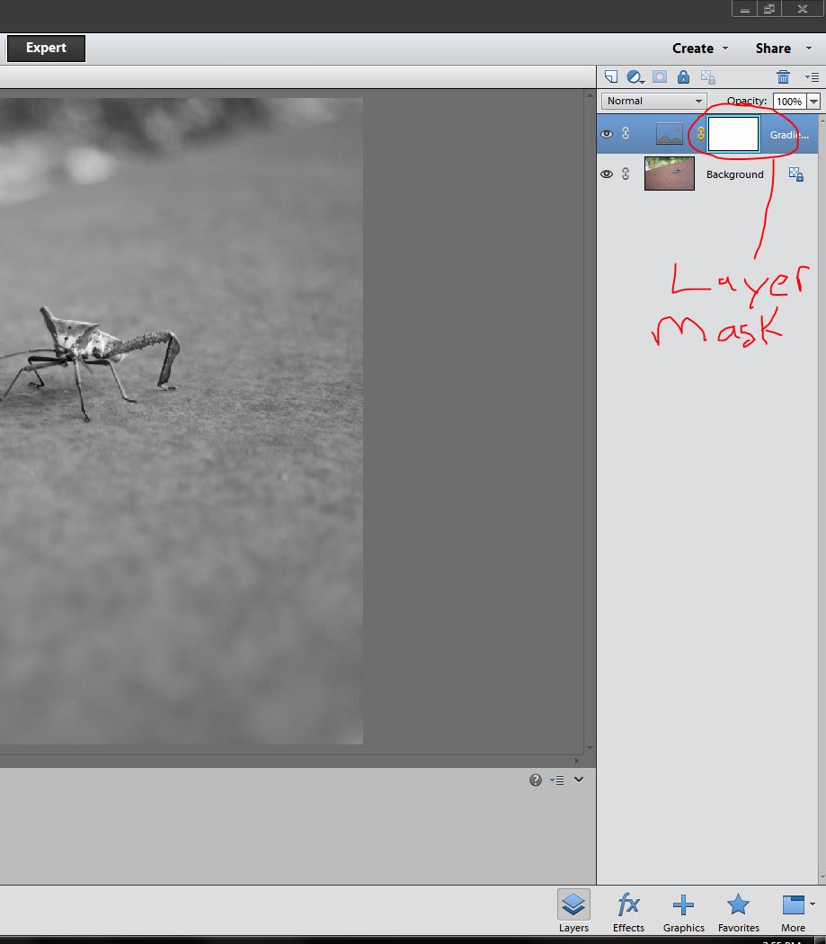
I’m going to select the brush tool (the tool I use most of the time when working with a layer mask). Using the brush at 100% opacity and with a soft edge I’m going to reveal some color by masking off the gradient map layer.
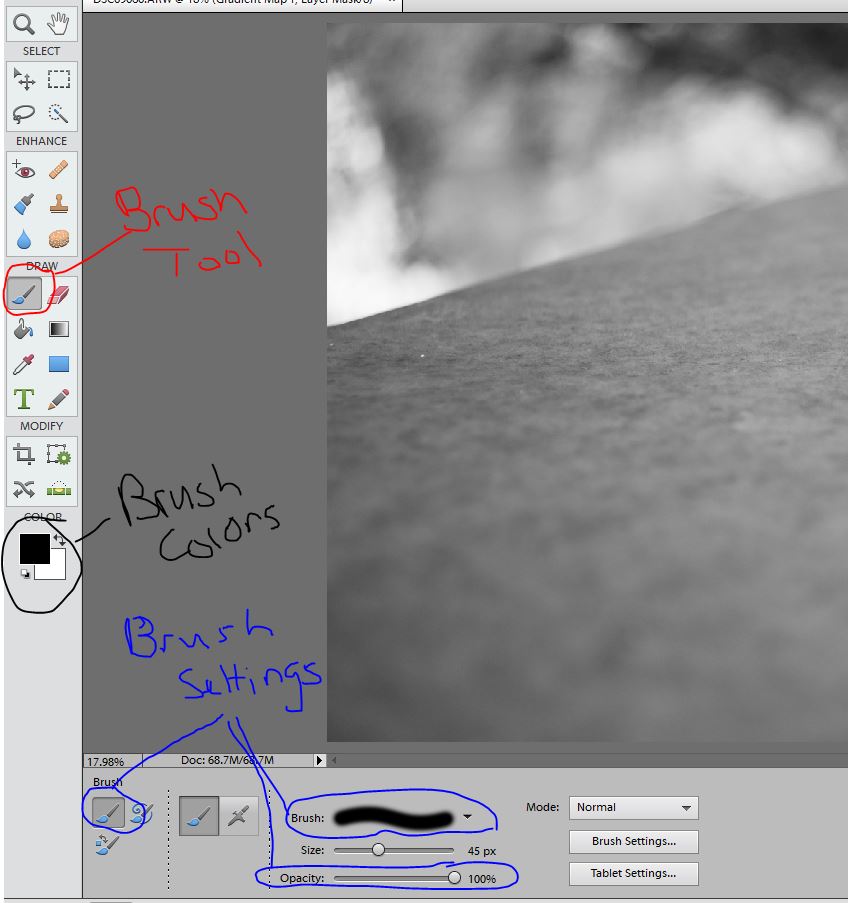
A black brush will remove and effect while a white brush will reveal the effect. So here I want a black brush.
I brush over the detail I don’t want effected by the layer in black while my layer mask is selected. Make sure the layer mask is selected. You paint the details you don’t want shown right on the image but you’ll see the black appearing on the previously white layer mask.
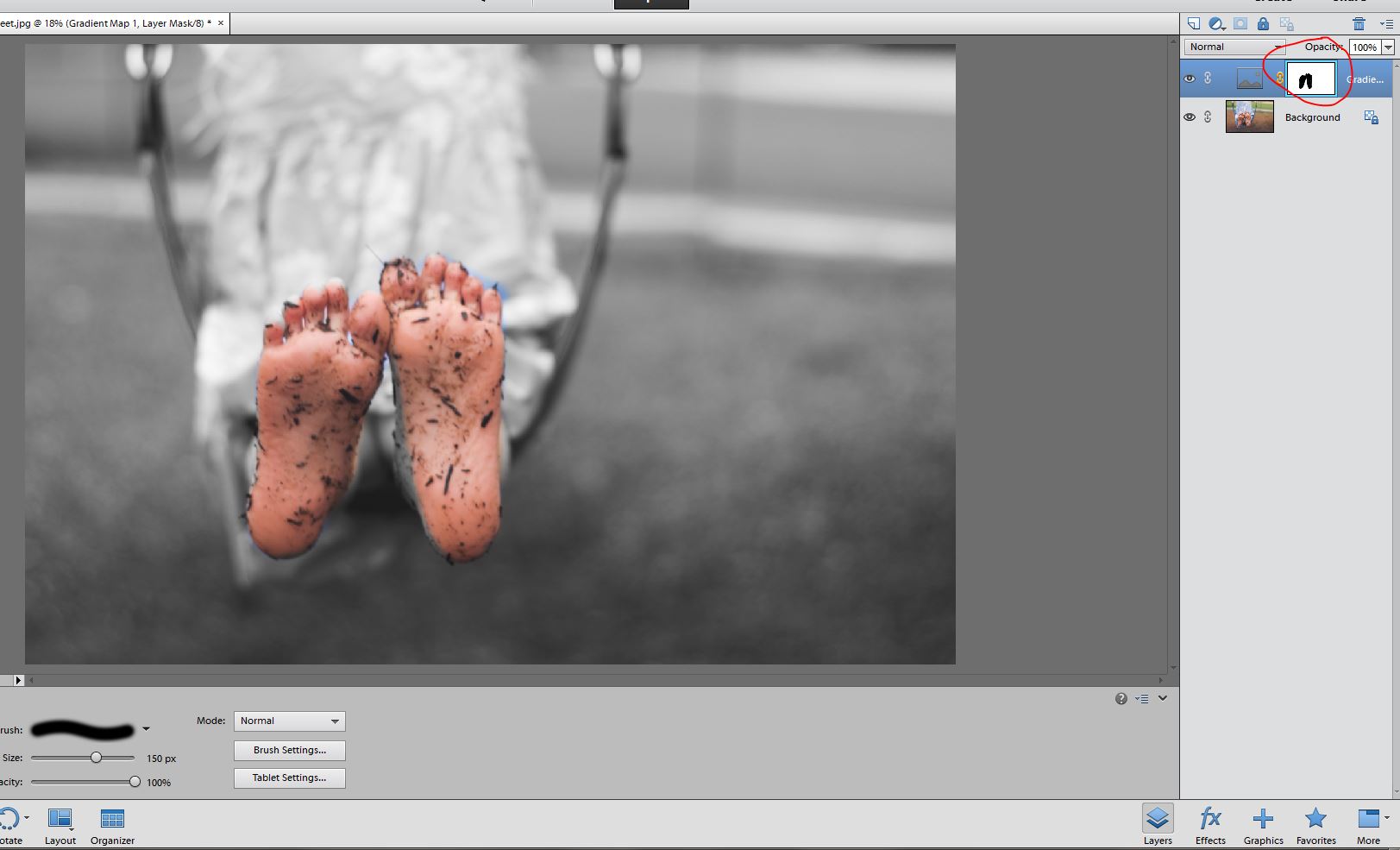
This reveals the layer below which is a color layer. Obviously if I really wanted to do this for this image, I’d need to spend a bit of time refining the edge by switching from black to white brushes and making sure I painted this the way I wanted. (Excuse the change in image mid-way through the tutorial. I suddenly realized the bug itself was black and white… epic fail.)
Adding a Layer Mask to a Layer without a Mask while Making a Vignette
Here I’m going to apply a vignette. It’s a fancy French word meaning to darken the edges of a photo so as to draw the viewers eye where the artist wants it. These are the steps I use to do that.
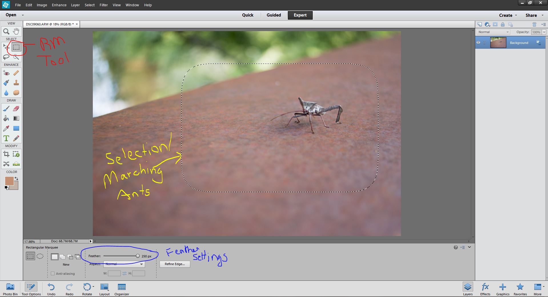
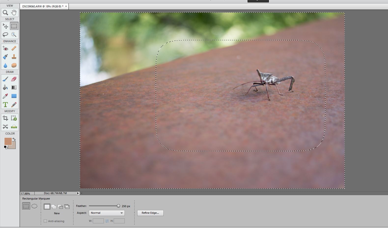
- Select the Rectangular Marquee Tool and change the feather settings to 250px
- Use the Rectangular Marquee Tool to select the part of my image that I don’t want effected by the vignette. You’ll see marching ants around your selection. If you don’t like where the selection ended up press Ctrl+D (or Cmd+D on a Mac) to deselect and try again.
- Right Click inside the selection and then click “Select Inverse.” Your Marching Ants/Selection will look like this now.

- Now right click your background layer and click “Duplicate Layer.” Click Okay.
- Then Select the Add Layer Mask Button and your selection will turn into a layer mask.
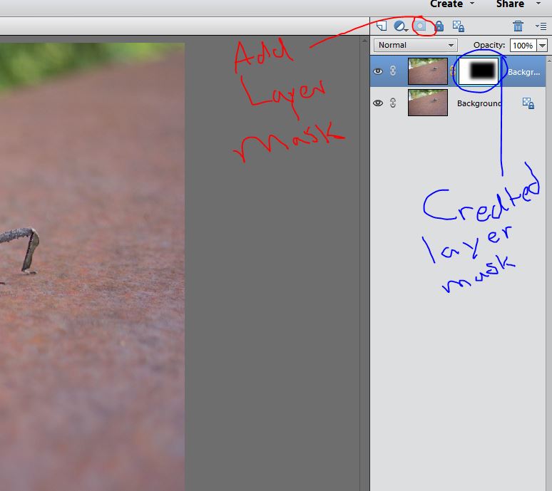
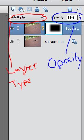
- Now change the Layer Type to Multiply and then adjust the Opacity of the Vignette to your liking.
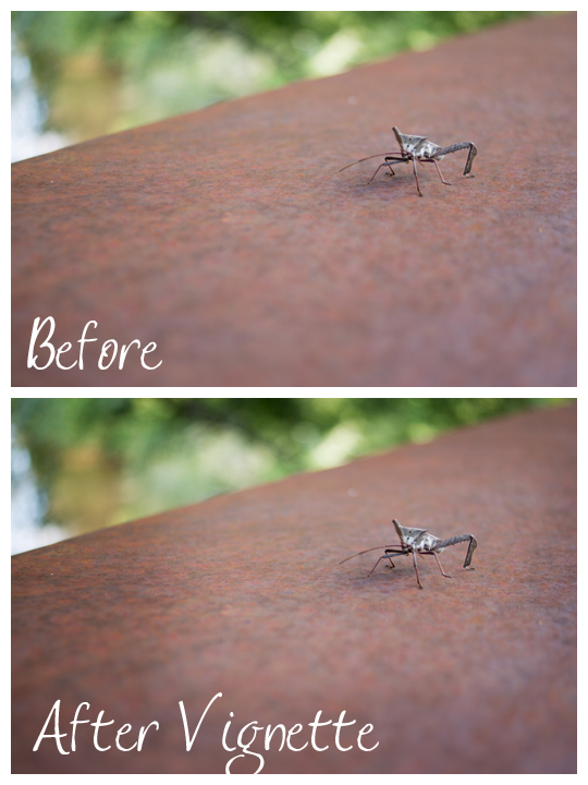
A quick before and after.
Final Layer Mask Thoughts
I know this was a super quick overview of layer masks, but I want you to know that Layer Masks are the secret superhero power of photo editing software. They are used in everything. I gave a beginners overview but if you want to learn more, I’ll once again send you to Amanda at Everyday Elements for further study.
Dec
03
2013I love black and white. One day I’m going to offer black and white film children sessions (if that sounds like a dream come true, contact me now!). Maybe next year I’ll whip out the old film camera and document my children’s lives in film. Sounds like I might have a project in the making…..
When I switched to digital, I used to get so upset about the black and white conversion. It was dull and ugly and I only knew the one way to do it. I really hated it.
Fortunately, hating my black and whites motivated me to learn to do black and white conversions in a number of ways. Today I’m going to share my favorite method of black and white conversion that I do manually in PSE and then share a small lists of black and white actions/presets that make my soul sing!
As a side note: I’ve been doing most of my black and whites in Lightroom recently. Also, before writing this post I was able to upgrade to Photoshop Elements 12. Woohooo! Ahem… I’m sorry that things look completely different that the last few editing posts, but this will help those with the newer software and I believe it looks a bit more like the Full Photoshop CS interface for those of you using that program.
Converting to Black and White Using Gradient Map
(Applicable to Both PSE and PS)
I learned how to convert to black and white with gradient map over at Everyday Elements (I’m telling you… she’s a goldmine of knowledge). Her take on this conversion is right here. Mine is below.
Here’s my starting color edit.
I click the Layers Palette in PSE12.
Then click the Layers Palette Half Moon Button (PSE doesn’t come with a manual… I’m totally making these names up as I go) and select Gradient Map.
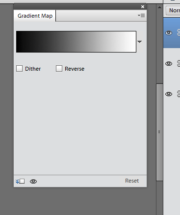
The Gradient Map will pop up. Your image could look mighty funky at this point depending on the selected gradient. Don’t worry! Double click the black and white bar(or whatever color you have showing up there) and the Gradient Map Editor will open.
Select “Black, White”. As you can see below, at this point I have an ordinary black and white conversion. It’s lacking the depth that I love so I’m going to play with the black, white, and midtone sliders (midtone isn’t visible until you start moving the black/white slider).
Move things around til you get the richness you want. Weird fact: one you have a midtone slider showing if you drag it toward black you midtones get lighter. If you drag it toward white they get darker. For some reason that seams backward in my head…
The following are my final settings. I moved me black slider in to darken Abel’s hair, moved my white slider in just a bit to darken the super bright white of Jenn’s shirt, and then moved my midtones slider over toward the black side to lighten up the skin tones just a tad. You can see the midtone slider below now 🙂
Tada! Beautiful black and white made super simple.
Some Favorite Black and White Actions/Presets
I love simplifying my editing workflow. Actions (PSE/PS) and Presets (Lightroom) make conversions simpler. I’ll do a full actions/preset post as the new year begins, but here are my favorite free black and white actions/presets.
Actions
Pioneer Woman’s Black and White Beauty in this Set
Pure Actions Free Black and White Batch (a basic Gradient Map conversion that I just taught you) and Baby Max Black and White.
Presets
34 Black and White Film Presets for Lightroom. If you can’t find a winner here, I’m not sure you will 🙂 I used to shoot Illford Delta 400… so that might be my favorite. But I like grainy images 🙂 But Illford HP5 (which my wedding was shot in) Curve is also a favorite.
12 Kodak Black and White Presets. If the above set didn’t meet your need… this will fill in.
Nov
26
2013This one is going to be a super long post. You’ll find that you prefer either levels or curves. That’s okay, but it’s nice to know how to use both. Personally, I’m a level’s girl, but I do like to use curves on newborns 🙂
Definitions
Histograms are Magic
I haven’t really talked about histograms during the course of this class because I feel like it’s an intermediate topic. I’m going to touch on it briefly here because both levels and curves are changing the histogram from your original image. A histogram is a chart showing you the relative tone quality of your pixels. The left of a histogram chart records dark pixels while the right of the chart records light pixels. You’ll read all over the web that a histogram with a gentle bell curve should produce the perfect exposure. Honestly, that’s just not true. Ready for a Quick Case Study?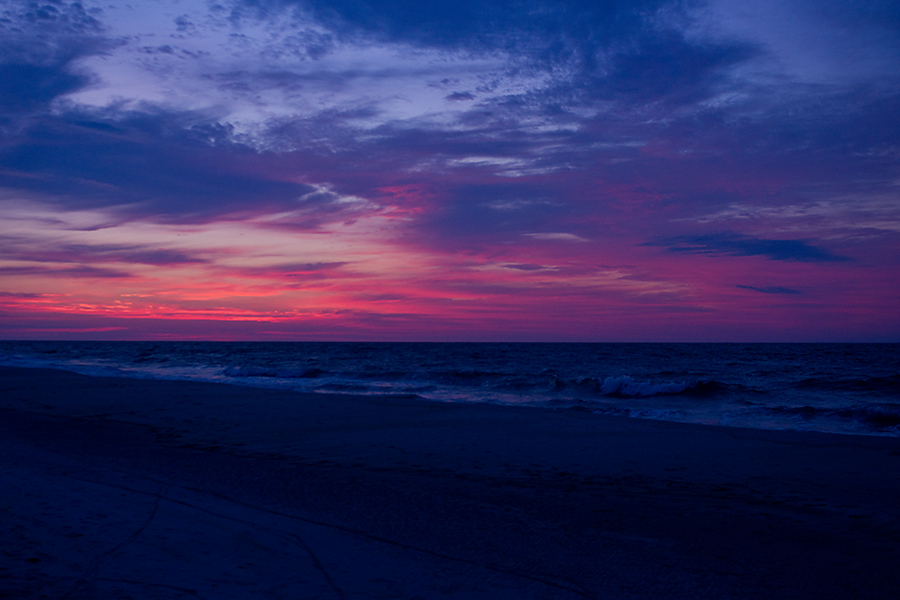
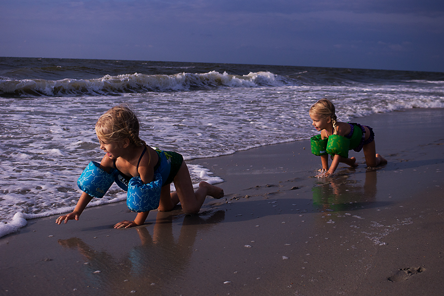
This image is pretty close to the ideal bell curve idea except for that spike in the dark tones likely caused by the dark beach/ocean. Is this a great exposure? Yes, for this image.
There’s a considerable amount of light tones in this image. Critics would gasp at this poor histogram if they saw it without the image, but I think the image is well exposed and edited.
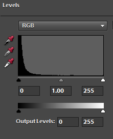
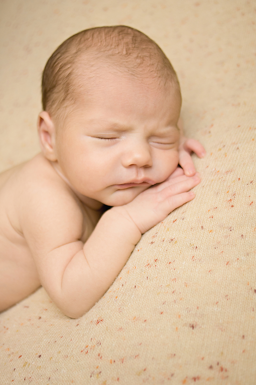
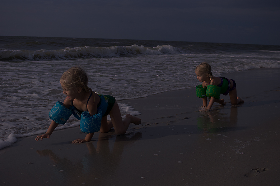
This image by our class member Amber has no curve at all in the histogram. It’s a steep rise into the darks. Is this okay? Yes. I think it’s slightly underexposed, but not be more than -2/3 stops.
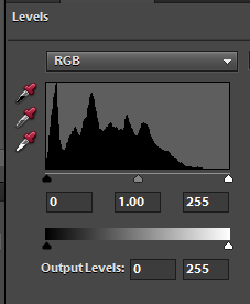
Now we can access the histogram through levels or curves, but it’s way more useful when we’re able to look at it while creating the image. Most DSLRs have the capability to show the histogram in the viewfinder, so jump into your manual and find out how. However, even if you choose not to use a histogram while shooting, you’ll benefit from knowing what a histogram should look like while you’re editing in levels and/or curves.![]()
Levels
Levels is a smarter and better way to adjust for small exposure difficulties and brighten an image than the Brightness/Contrast function. Levels can fix exposure, assist in correcting white balance, and a host of other things. Here I’m going to teach you only the first two. If you want to know more about the power of levels: Browse through this post at Everyday Elements.
Curves
Curves is a little more difficult for me to accurately define. Basically, it’s extremely similar to levels, but it deals a bit more with contrast than brightness. Curves can be used to fix exposure, change white balance, and alter color tones. A much better summary of what curves does can be found here.
Editing with Levels in Photoshop Elements
I’ll keep working on the same image throughout this editing series for the sake of consistency. It’s a pretty basic image that anyone could have taken.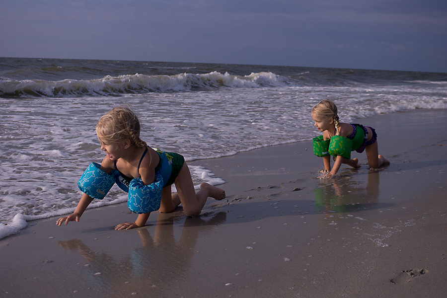
To open a Levels Adjustment Layer in PSE, You’ll click the half moon circle and then select levels.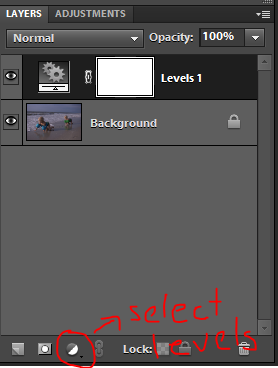 Again, depending on how your PSE interface is set up, you’ll either click your Adjustments tab or an adjustment interface will pop up.
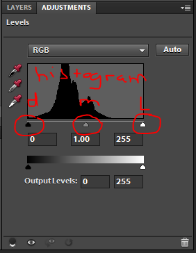 Do you see those little triangles. Those are the dark, mid, and light tones sliders. This is where a great deal of work is done in Levels. For this image, I can see by the histogram that there are not any highlights in the image. So first, I’ll slide my white triangle into the point where the histogram begins to rise. I still think this image is a little dark and levels is more effective at bringing in brightness evenly than the brightness/contrast layer. So I slide my midtone triangle to the left to make the midtones brighter.
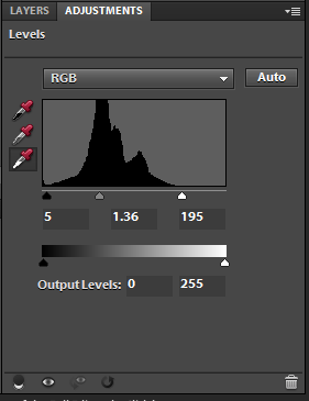 Here is my resulting image.
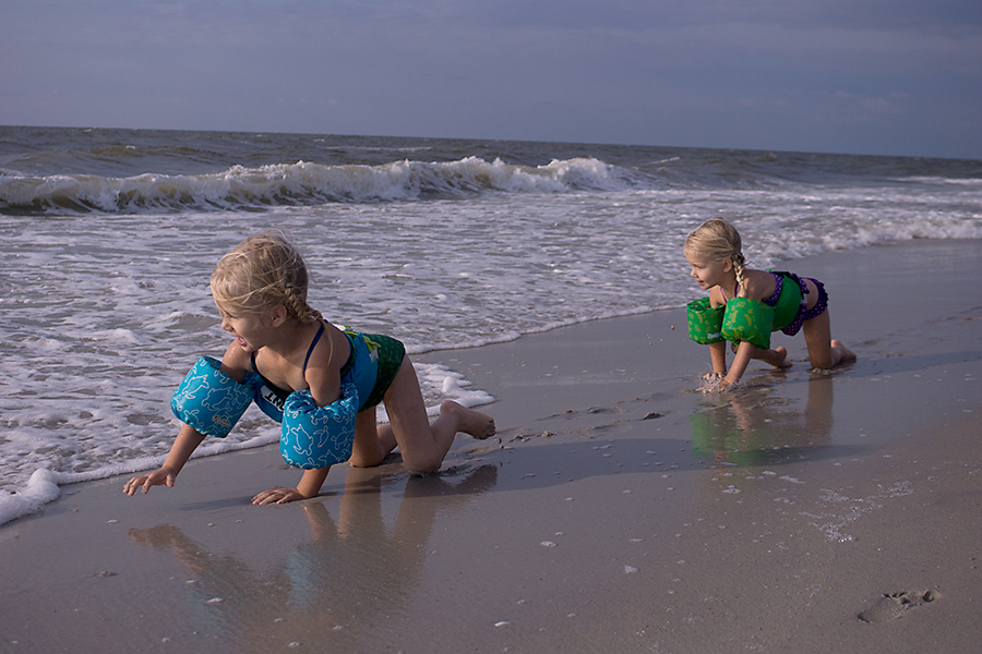 Now levels can also be used to fix white balance issues. If you have an image that is too warm or blue or has strange color casts, you can click one of the corresponding eye droppers. There’s a black, gray (18% gray), and white eye dropper along the left of the levels box.
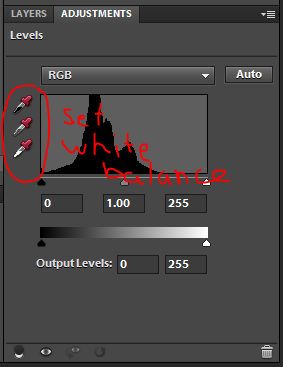 You select the one that you have in your image. For this image, I knew that the white foam highlights should be pure white. Your image may have a black color. A good place for gray is in the whites of the eye, but you’ll have to click in a few places and use undo (Ctrl/Command plus Z) to find the best spot.
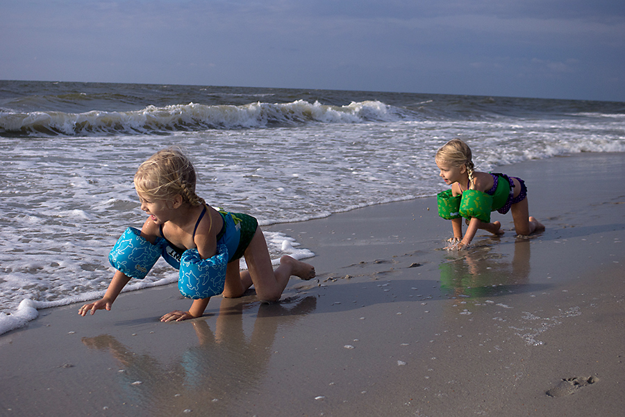
Here’s my image after correcting the white balance.
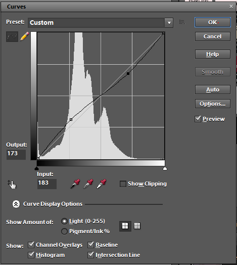
Editing Curves in Photoshop Elements
PSE does not have native access to curves. But that can be overcome through an action which you install into your effects palette. I’m sure there are lots of free curves actions out there, but the one I use is Everyday Elements Curves. Here is how to install an action in older versions of PSE (which I’ll link to repeatedly in the future). Here’s my Curves action in my Effects panel.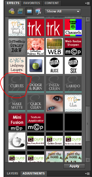 When I click it, the curves function box pops up like this.
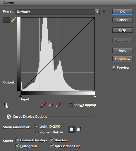 Like levels the curves box is representing from left to right: dark, mid, and light tones. Clicking on the curve and moving it upward will result in brightening the corresponding section while moving it downward darkens the image. Most people use Curves to create what they call a contrast “pop” but applying a slight S-Curve to the image. Here’s what that would look like.
Here’s the resulting image. This would likely look great on any well-exposed image with a good range of tones… but this image is missing lots of dark or light tones.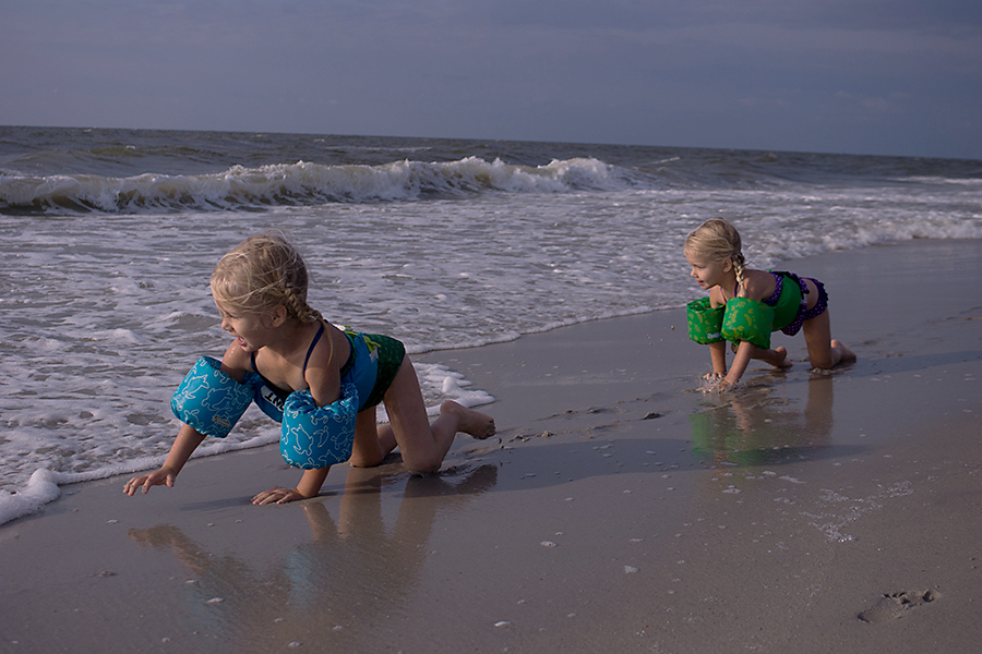 However, what this image needs most is the mid tones brightened. So I brought my the mid tone section of my curve up towards brighter significantly.
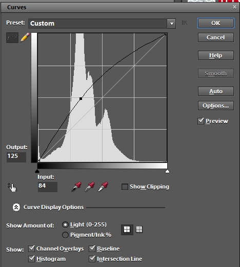
Here is the resulting image.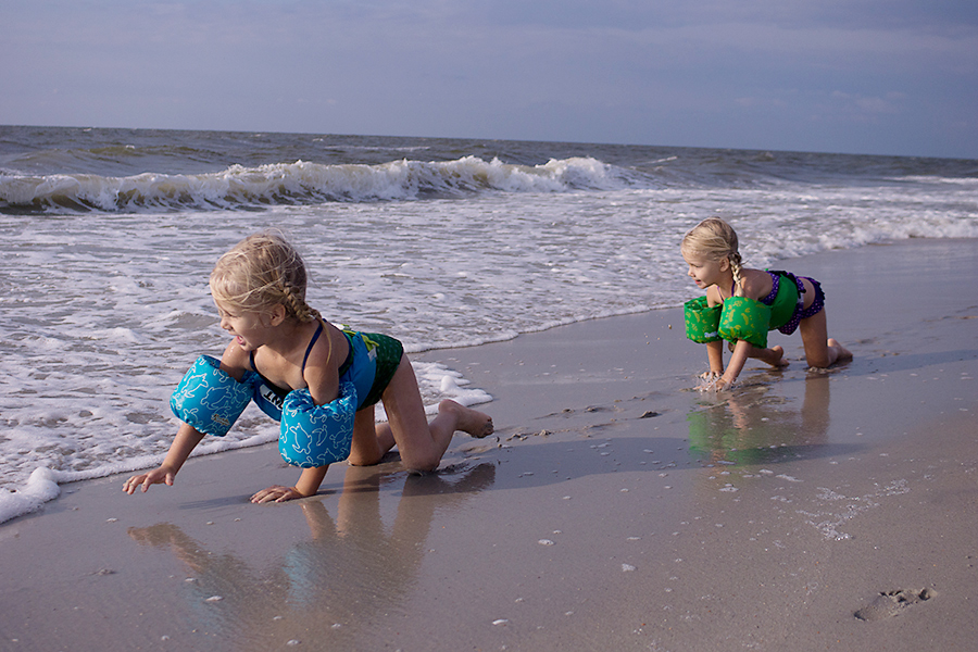
As a side note: to adjust white balance in curves, you use the eyedroppers in the same way that you used them in levels 😉
Nov
19
2013Editing tutorials from this class will have the following components: Definition of the functions to be highlighted, recommended uses, and a visual section where I show you how it’s done in Photoshop Elements (or maybe Lightroom if it’s similar). There will not be a lot of words in the sections showing you how to use these functions so if you need help using them comment and I’ll respond.
Definitions
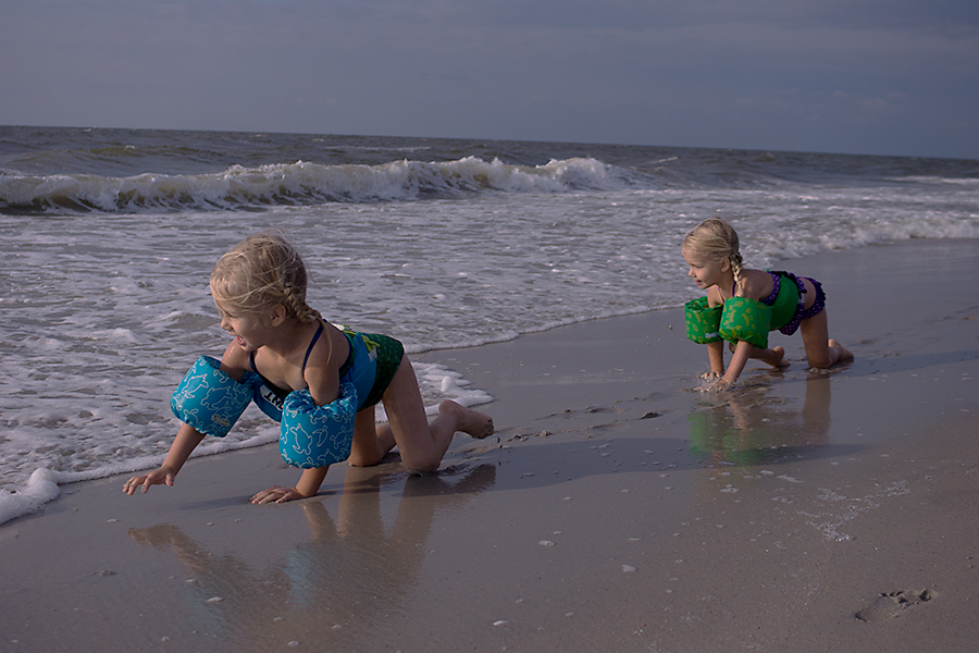
I’ll try to make this visual. This is the SOOC image I’ll be working with.
Brightness
Brightness is really what it sounds like: how bright an image will be. It deals mainly with the quantity/quality of the whites in an image. The brightness slider will not fix under or over exposure but it will make your image brighter or darker when used.
Added Brightness (exaggerated)
Subtracted Brightness (exaggerated)
Contrast
Contrast is the amount of difference between black tones in an image and white or lighter tones. An image that is either all dark, all midtones, or all light lacks contrast; we call these types of images flat. Flat images lack depth.
Added Contrast (exaggerated)
Subtracted Contrast (exaggerated)
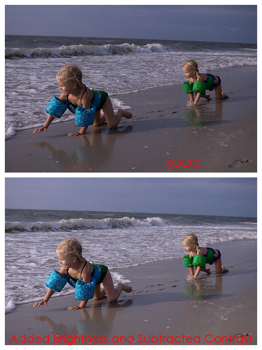
Final Image
I added brightness and took away contrast for this final image.
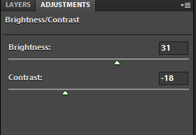
Here are the two together and the following is the screen shot of my adjustments in Photoshop Elements.
Recommended Uses
One of the ways I use the brightness slider is to lighten up skin tones. Usually I use this with a layer mask (tutorial coming) to make sure I don’t overdo it. But really brightness can be used to make any image have brighter or darker. Here I’d really recommend you experiment to learn what you like.
Contrast is best used to make a flat image deeper or to reduce contrast in an extremely contrasted scene. Most of the time you’ll find that your flattest images will be those which have lots of midtones and no white or black. Using the contrast slider will help you create depth with these flat images. Likewise, reducing contrast in a scene where you have lots of white and black will emphasize the midtones.
Visual Instructions for Use in Photoshop Elements
***Note: I use Photoshop Elements 9 which is almost 3 years old. Your interface may look slightly differently.
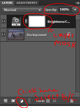
To launch Brightness/Contrast in PSE, you click this half circle thing and then select “Brightness/Contrast”. Depending on how your interface is set up, either PSE will bring up an adjustment layer beneath your Layers Palette or you’ll have to click the Adjustments tab next to your the Layer Palette.
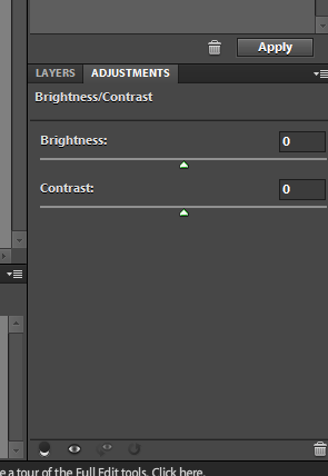
Moving the sliders to the right will increase brightness/contrast and moving to the left will reduce brightness/contrast.
